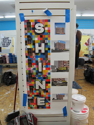
I've started and finished my internship with the Philadelphia Mural Arts Program all before the internship officially starts - July 1st! This is due to me thinking I was going to be in Poland for the first two weeks of the internship, but then Poland was cancelled, and then rescheduled, so now I would be missing the last two weeks of the internship. The mural I'm working on was designed by James Burns, and is unofficially titled "Rise and Shine". It will be going up on the corner of N Broad St and Lehigh Ave. There will be two murals, one that says "Rise" and one that says "Shine", with Rise being the more gigantic of the two. The text of each word is filled with collages that patients at Sobriety Through Out Patient (s.t.o.p) created. The background is a bunch of colored squares, which occasionally contain a portrait of a patient or staff at S.T.O.P., community member, mural arts person, etc.
I painted that lady's upside down face!
This is the top of the I and S of the "Rise" mural - to give you a sense of the scale. This mural is painted on "parachute cloth" aka underlining fabric cut into 5' x 5' squares. This is a relatively recent method of mural painting in Philly - beginning in the 1990's, which allows muralists to paint year round, spend less money on renting scaffolding (the most expensive cost of creating a mural) and allows the public to help out a lot more (the public can only work on the ground level of a mural due to insurance issues if it's painted directly on the wall)
One of the more ridiculous sections of a collage.
A finished section of the mural.
Kien, the lead assistant with no website for me to link you to, rolling up one of the rows of the mural.
One or two days per week, people at S.T.O.P paint within the "paint-by-numbers" style print outs. I spend most of my time re-drawing vertical and horizontal level lines, and cleaning up the squares. I'm thrilled to be able to brag about how I can now split a ball-point pen line in half when painting straight lines. I've never been particularly good at straight lines, so this is one hell of an accomplishment for me. (Note: the violin.)
This is usually what we're workin' with.
I love the tacs! They get really fat with layers of paint!
These are some tacks on the paint-splattered floor - they are impossible to see on it.
A particularly nice tac.
The design of the "Rise" mural.
This is a violin I painted - it's probably four to five feet tall.


No comments:
Post a Comment